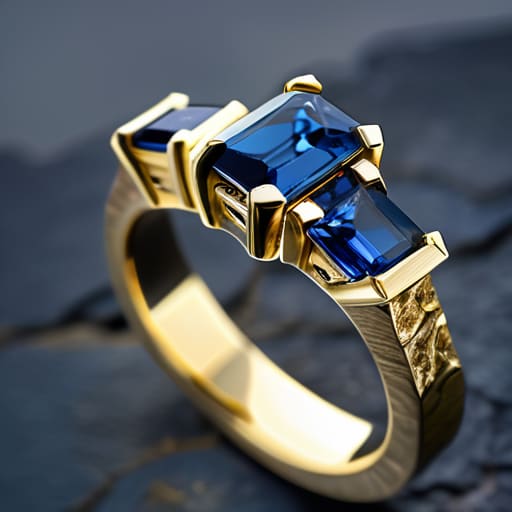
I remember sitting in a cramped grading lab in Bergen, staring through a loupe at a pale morganite that looked absolutely dead in a silver setting. It had this flat, greyish cast, like a pebble pulled from a freezing fjord just before the sun hits it. People will try to sell you on the “spiritual energy” of a specific metal, but they’re ignoring the basic physics of light. The truth is much more practical: metal colour and how it changes the stone it holds is a matter of light reflection and color theory, not magic. A yellow gold setting can turn a muddy citrine into something that looks like liquid honey, while a white metal might make a delicate sapphire look like a piece of washed-up sea glass.
I’m not here to give you a lecture on gemstone mysticism or tell you which metal aligns with your chakras. Instead, I’m going to show you how different alloys—from the warmth of rose gold to the clinical bite of platinum—actually interact with the chemistry of your stone. I’ll help you pick a setting that makes the color pop rather than one that makes it look cheap. What you choose to do with the finished piece is entirely up to you, but at least you’ll know exactly why it looks the way it does.
Understanding Metal Colour and How It Changes the Stone It Holds
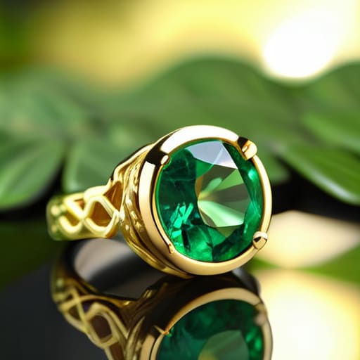
When you put a stone in a setting, you aren’t just holding it; you’re changing the way light hits it. I think of it like looking at a piece of quartz through a tinted window. If you take a deep, forest-green emerald and drop it into a yellow gold setting, the metal bleeds into the stone. It amplifies the warmth, making the green feel lush and heavy, almost like moss on a sun-drenched rock. This is the visual impact of gold on colored stones—it leans into the heat.
If you prefer something crisper, like a sapphire that looks like the North Sea on a clear day, you want to look at warm vs cool metal tones for gemstones. A silver or platinum setting won’t fight the stone; it acts as a neutral backdrop that lets the blue stay sharp and biting. On the other hand, rose gold can sometimes make a pale stone look muddy if the tones clash. It’s all about how the metal reflects back into the facets. You can use the setting to either boost the color or let the mineral speak for itself.
Key Things to Know
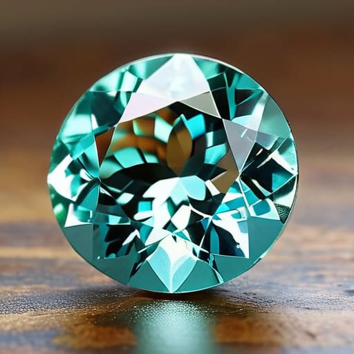
First, you need to look at the temperature of the metal. When I’m at the bench, I’m always thinking about warm vs cool metal tones for gemstones. If you have a stone with a blue-green hue—the color of a shallow fjord after a rainstorm—putting it in yellow gold is going to fight the stone. The yellow pulls the warmth out of the metal, which can make those crisp blues look muddy or even slightly greenish. If you want that blue to stay sharp and icy, silver or white gold is your best bet.
Second, pay attention to how the metal interacts with the stone’s intensity. It isn’t just about the color, but the visual impact of gold on colored stones in terms of their perceived depth. A high-karat yellow gold can act like a spotlight, making a pale citrine look much more saturated and rich than it actually is. On the flip side, a duller silver setting might act like a silver setting gemstone color enhancement for something like an amethyst, making the purples look deeper and more velvet-like. It’s all about how the light bounces between the two.
Practical Tips and Steps
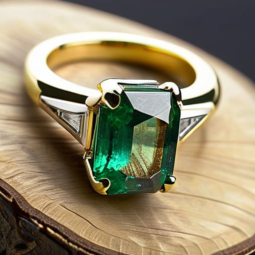
When you’re standing at the jeweler’s counter, stop looking at the stone in isolation. I always suggest grabbing a small mirror or even just using your phone camera to see the piece from a distance. If you’re looking at a deep, forest-green emerald, try it in yellow gold first. You’ll notice how the visual impact of gold on colored stones tends to lean into those earthy, organic vibes—it makes the green look heavy and rich, like moss after a heavy rain. If you switch to silver or platinum, that same emerald might suddenly look sharper, almost electric, because the metal isn’t competing for the warmth.
If you are working with something more delicate, like a pale aquamarine, pay close attention to how metal settings affect stone saturation. A bright, polished yellow gold can sometimes make a light blue stone look a bit muddy or “tired.” In those cases, I usually lean toward white metals. It keeps the colors clean and prevents the metal from bleeding its hue into the crystal’s clarity. It’s not about what looks “expensive,” it’s just about whether the metal is helping the stone speak or trying to shout over it.
Common Mistakes to Avoid
The biggest mistake I see is people choosing a metal based solely on what they already have in their jewelry box, rather than looking at the stone itself. It’s easy to grab a silver chain because it’s easy to wear, but if you’re holding a warm, honey-colored citrine, that silver setting might actually make the stone look muddy or gray. You lose the vibrancy. When you’re deciding on warm vs cool metal tones for gemstones, you have to stop thinking about your wardrobe and start looking at the light refraction inside the crystal.
Another slip-up is assuming a metal will “fix” a stone that lacks life. I’ve seen people try to use a bright yellow gold setting to mask a pale, washed-out sapphire. It doesn’t work; it just makes the stone look tired. Instead of trying to force a correction, look for how metal settings affect stone saturation. If a stone is deep and saturated, like a forest-green emerald, let it breathe with a metal that doesn’t compete for attention. Don’t try to over-engineer the glow—just find the balance.
Final Thoughts
At the end of the day, choosing a setting isn’t about following some rigid rulebook of fashion. It’s about how you want to see that stone when the light hits it. I’ve spent enough time behind a loupe to know that a stone’s character is a conversation between its chemistry and its surroundings. You might find that a specific silver setting gemstone color enhancement makes a pale aquamarine look like a piece of frozen seawater, while a yellow gold setting makes it look like something much warmer and more sun-drenched.
Whether you are looking for a specific rose gold gemstone pairing guide to soften a moody garnet, or you just want to see how much pop you can get out of a sapphire, remember that there is no “wrong” choice. There is only the choice that makes you look at the stone and feel something. I’ll give you the science of how metal settings affect stone saturation and how the light bounces around, but the way the piece makes you feel when you put it on? That is entirely your department.
The Alchemy of Setting
A gemstone doesn’t exist in a vacuum; it’s a piece of chemistry sitting in a cradle of metal. You can take a pale, seawater-green tourmaline and make it look moody and expensive in silver, or you can wrap it in yellow gold and make it look like a bright summer morning. The metal doesn’t just hold the stone—it tells the stone how to behave.
Dagny Solheim
The Final Look
At the end of the day, choosing a metal isn’t about following a rulebook; it’s about managing how light interacts with the chemistry of your stone. Whether you are leaning into the warmth of yellow gold to make a citrine look like sunlight hitting a shallow tide pool, or using the cool, clinical edge of platinum to sharpen the fire in a diamond, you are essentially directing the viewer’s eye. Remember that the metal acts as a frame, and just like a heavy wooden frame might swallow a delicate sketch, a metal that is too heavy or the wrong hue can completely mute the stone’s natural personality. Keep an eye on the undertones, watch how the light bounces between the setting and the facet, and you won’t be surprised by what you see when you finally put the piece on.
I’ve spent enough time under a loupe to know that stones are remarkably stubborn things. They have their own internal logic, their own inclusions, and their own specific ways of catching the light. You can try to force a stone to look a certain way by choosing a specific metal, but the most beautiful pieces are usually the ones where the metal and the mineral have reached a quiet agreement. Whether you want your jewelry to scream for attention or sit quietly against your skin like a smooth pebble from the shore, trust your own eyes over the trend reports. Once you understand the science of the setting, the rest is just your own personal story.