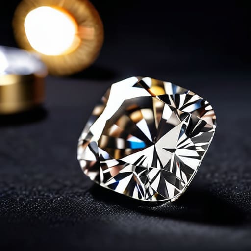
I spent six years hunched over a microscope in a grading lab, staring at stones until my eyes felt like they were filled with sand. I’ve seen enough “designer” cuts to know that most of the marketing around cushion cut proportions and how to read them is nothing more than expensive smoke and mirrors. Salespeople love to use flowery language about “romance” and “soul” to distract you from the fact that a stone is actually just a series of mathematical angles. If the depth is too high, that gorgeous diamond will look dark and muddy, like a piece of sea glass lost in a deep tide pool, rather than the bright, dancing light you were promised.
I’m not here to sell you on the magic of the cut; I’m here to give you the technical reality. I will strip away the jargon and show you exactly which numbers on a certificate actually matter and which ones are just noise. By the end of this, you’ll know how to look at a spec sheet and see the truth of the stone’s brilliance, so you can decide if it’s actually worth your money.
The Raw Truth About Cushion Cut Proportions and How to Read Them
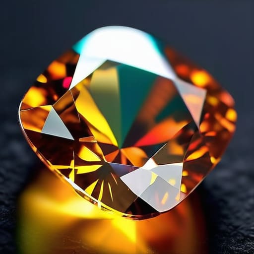
When you look at a cushion cut through a loupe, you aren’t just looking at a shape; you’re looking at how a cutter decided to manage light. Most people get distracted by the “pillow” look, but the real story is in the math. I always start with the cushion cut length to width ratio. If the ratio is too high, you’ve got a stone that’s trying to be an oval; if it’s too low, it looks like a blunt square. I like a ratio that feels intentional—something that sits comfortably between 1.05 and 1.15 for that classic, romantic silhouette.
Then there is the depth. If the ideal cushion cut depth percentage is too deep, the light just gets lost in a dark well at the bottom of the stone, making it look duller than a wet pebble. You want that light to bounce back to your eye, not sink into the pavilion. I also keep a close eye on the cushion cut table percentage. A table that is too large can make the stone look flat and lifeless, stripping away the very character that makes a cushion cut special in the first place.
Decoding the Cushion Cut Length to Width Ratio Without the Fluff
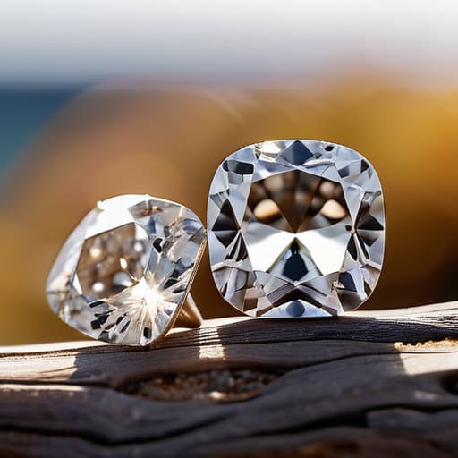
When you look at a cushion cut, the first thing your eye does is try to decide if it’s a square or a rectangle. That’s where the cushion cut length to width ratio comes in. If the ratio is 1.00, you’ve got a perfect square. As that number climbs toward 1.10 or higher, the stone starts stretching out into a more elongated, rectangular shape. It’s a bit like looking at a piece of sea glass after a storm; some are chunky and rounded, while others are long and thin. Neither is “wrong,” but they change the whole vibe of the ring.
I always tell people to stop obsessing over whether a stone is “perfect” and start looking at the diamond shape aesthetics that actually suit their hand. A square cushion can look quite chunky and substantial, whereas an elongated one can make a finger look longer and more elegant. You aren’t just buying a mineral; you’re buying a silhouette. Just remember that as the shape shifts, the way the light dances inside changes too, so don’t be afraid to tilt the stone and see how it handles the light before you commit.
What the Ideal Cushion Cut Depth Percentage Actually Reveals
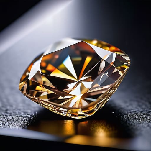
When you look at a stone’s depth percentage, you aren’t just looking at a number on a grading report; you are looking at how much of the diamond’s mass is hiding in the bottom. If the depth is too high, the stone is “bottom heavy.” It’s like a pebble from the North Sea that looks small in your hand because all its weight is tucked away in a thick, deep belly. You end up paying for carat weight that you can’t actually see. On the flip side, a stone that is too shallow will leak light out the sides like a sieve. You want that ideal cushion cut depth percentage to be a sweet spot where the light hits the pavilion and bounces back to your eye rather than passing straight through the bottom.
This measurement works hand-in-hand with the cushion cut table percentage to dictate how much “life” the stone has. If the table is too large and the depth is too shallow, the diamond can look flat and lifeless, almost like a piece of glass. I look for a balance where the depth allows for enough internal reflection to create cushion cut brilliance and fire without making the stone look like a heavy, dark lump.
Measuring the Cushion Cut Table Percentage Against the Sales Pitch
When you look at a certificate, the table percentage is just a number, but in the hand, it’s what dictates how much “face” the stone actually has. The table is that flat, large facet on top. If the table is too wide—say, over 70%—the stone can start to look a bit shallow and lifeless, like a puddle that’s dried up under the sun. You lose that interplay of light that makes a cushion cut special. On the flip side, a smaller table often allows for more cushion cut brilliance and fire because it leaves more room for the crown facets to do their job, breaking the light into those tiny, dancing flashes we all look for.
I’ve sat in labs looking at stones where the sales pitch promised “maximum sparkle,” but the table was so massive the diamond looked like a flat piece of glass. It’s a common trick to make a stone look bigger from a distance, but it sacrifices the soul of the cut. When you’re checking the specs, look for a balanced table percentage that complements the rest of the proportions. You want a stone that holds light deep inside, rather than one that just reflects a flat, white glare.
A Diamond Facet Arrangement Guide for Seeing the Real Stone
Once you’ve moved past the basic measurements, you need to look at how the facets actually sit. Think of it like looking at the surface of the North Sea just before a storm; the way the light breaks is everything. When you’re using a diamond facet arrangement guide, you aren’t just looking for a pattern; you’re looking for how the facets interact to create light. In a cushion cut, you want to see a balanced distribution of crown and pavilion facets. If the arrangement is wonky, the light won’t bounce back to your eye correctly, and you’ll end up with a stone that looks “dead” or dark in the center.
This is where you really start understanding gemstone symmetry on a practical level. A well-cut cushion should have facets that meet with precision, creating a sense of organized chaos. If the facets look crowded or uneven, the stone will struggle to produce cushion cut brilliance and fire, no matter how much the salesperson promises its “extraordinary sparkle.” I always tell people to look for a rhythmic flow in the facet pattern. If the light looks like it’s getting trapped in a corner rather than dancing across the surface, the proportions are likely fighting against the facet layout.
Understanding Gemstone Symmetry to Separate Beauty From Deception
When you look at a cushion cut through a loupe, you aren’t just looking for a pretty shape; you’re looking for balance. Symmetry in a cushion cut isn’t about being a perfect square—it’s about how the facets align across the stone. If the facets are off, the light doesn’t just scatter; it gets trapped or leaks out the sides. I’ve spent years looking at stones that look stunning in a well-lit display case, only to find that once you hold them up to the sun, the light hits a lopsided facet and the whole effect collapses.
To get this right, you have to look past the diamond shape aesthetics and check if the corners and edges mirror each other. If one side looks slightly more “squashed” than the other, it’s a sign of poor cutting. This lack of balance is exactly what kills cushion cut brilliance and fire. You want the light to dance evenly across the surface, not stutter because one side of the stone is doing more work than the rest. If the symmetry is wonky, the stone will always feel “dead,” no matter how much a salesperson promises it’s high quality.
Balancing Cushion Cut Brilliance and Fire With Diamond Shape Aesthetics
When you’re looking at a cushion cut, you’re essentially looking for a tug-of-war between two different personalities. On one side, you have the “crushed ice” look, where the facets are so crowded they create a frantic, shimmering spray of light. On the other, you have the “broad facet” look, which feels more organized and traditional. Finding the right balance in cushion cut brilliance and fire isn’t about hitting a mathematical sweet spot found in a textbook; it’s about how the light actually behaves when the stone is sitting on your finger.
If the proportions are off, you might end up with a stone that looks beautiful on a jeweler’s loupe but loses its soul in natural light. A stone with a high table percentage might look bright, but it can lack that deep, soulful glow that makes a cushion cut special. I always tell people to look for how the light moves through the depths. You want a stone that holds its color and reflects light in a way that feels intentional, not accidental. It’s about finding that specific diamond shape aesthetics that makes the stone feel like a solid object rather than just a collection of bright spots.
## Beyond the marketing jargon
A cushion cut isn’t just a shape; it’s a math problem that determines whether your diamond looks like a bright, dancing light or a dull, heavy chunk of glass. When you look at those proportions, don’t listen to the salesperson’s adjectives—look at the numbers to see if the stone is actually holding the light or just swallowing it.
Dagny Solheim
Making sense of the numbers
At the end of the day, a cushion cut isn’t just a single number on a certificate; it is a delicate balance of depth, table size, and that specific length-to-width ratio that gives the stone its character. We’ve looked at how a deep stone might hide its light, how a table that’s too large can kill the fire, and how symmetry acts as the final gatekeeper between a brilliant gem and a dull one. If you can look past the marketing jargon and focus on the actual physical proportions, you stop being a passive buyer and start being a person who understands the geometry of the stone. It’s about knowing that the math dictates the light, and the light dictates the soul of the diamond.
I know that staring at a spreadsheet of percentages can feel a long way from the magic of holding a gemstone in your hand. But whether you are buying an engagement ring or just a piece of mineral history, having the technical truth in your corner changes the experience. Once you strip away the sales pitch and understand the composition of the cut, you can finally stop worrying about being cheated and start focusing on the stone itself. Whether you see a mathematical marvel or a piece of wearable art, trust your eyes once the numbers have done their work.