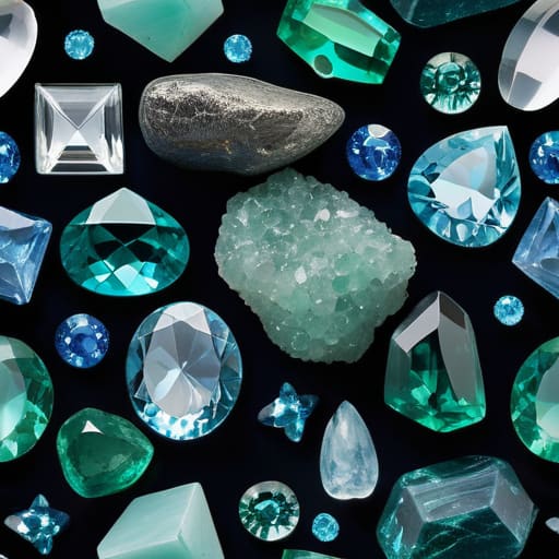
I spent six years hunched over a microscope in a grading lab, staring at stones until my eyes burned, and if there is one thing I learned, it’s that the industry loves to use fancy language to inflate a price tag. You’ll walk into a shop and hear someone wax poetic about the “ethereal teal nuances” of a stone, but most of the time, they’re just trying to make a common mineral sound like a miracle. When it comes to blue green gemstones and the names given to the shade, the terminology often feels like a smokescreen designed to hide a lack of depth or, worse, to disguise a synthetic. I’ve seen stones that look like the deep, murky green of a fjord after a storm being sold under names that imply a clarity they simply don’t possess.
I’m not here to sell you on the “energy” of a color or use flowery adjectives to justify a markup. My goal is to strip away the marketing fluff and tell you exactly what you are looking at—the mineral composition, the hardness, and the actual color. I’ll help you navigate the confusing vocabulary of blue green gemstones and the names given to the shade so you can tell a high-quality tourmaline from a cheap glass imitation. Once you know the science behind the hue, you can decide if you want to wear it, gift it, or just keep it on your desk.
Understanding Blue Green Gemstones and the Names Given to the Shade
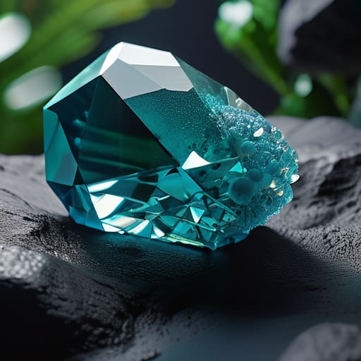
When you look at a stone that sits right on the fence between blue and green, the first thing you notice isn’t just the color, but the depth. I usually think of it in terms of how the North Sea looks right after a storm—that heavy, saturated teal that looks almost black until the light hits it. In professional gemology color classification, we try to be precise, but even for us, the lines blur. One person sees a deep sea-foam, while another sees a bright peacock hue. It’s less about being “right” and more about where the stone sits on the gemstone color spectrum terminology scale.
The confusion often starts because of how we market them. You’ll see a shop listing something as “aquamarine” when it’s actually a much darker, greener tourmaline, or perhaps a piece of dyed chalcedony being sold as high-end turquoise. To get it right, you have to look at the saturation. A true aquamarine has a certain clarity and a pale, watery lightness, whereas a teal gemstone tends to hold onto its pigment with much more stubbornness. Once you learn to spot that difference, you won’t get tripped up by the labels.
Key Things to Know
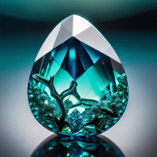
When you’re looking at a stone through a loupe, the first thing you realize is that “blue-green” is a massive, messy category. In my years in the lab, I’ve seen how easily people get tripped up by gemstone color spectrum terminology. A stone might look like a deep sea swell one moment and a bright tropical lagoon the next, depending entirely on how the light hits the crystal lattice. You aren’t just looking at a color; you’re looking at how light is being absorbed and reflected by specific elements like iron or copper.
To get any clarity, you have to look past the marketing. I always start by checking the saturation and the “temperature” of the hue. For instance, when comparing aquamarine vs teal gemstones, the difference is often found in the depth of the green. Aquamarine leans toward a pale, watery transparency, while teal pulls more toward a heavy, saturated teal-like shade you might see in a deep fjord. Understanding these naming conventions for colored gems helps you realize that a name is often just a shorthand for a specific chemical signature.
Practical Tips and Steps
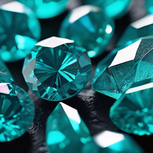
When you’re sitting at a desk with a loupe or just scrolling through a shop online, the best way to start is by looking at the light. I always tell my students to imagine the stone is sitting at the bottom of a shallow, clear fjord. If the color looks like a bright, tropical lagoon, you’re likely looking at turquoise and cyan mineral shades. If it has that deeper, more moody quality—the color of the North Sea just before a storm hits—you’re moving into the realm of teal or dark aquamarine.
Don’t get bogged down in the heavy gemology color classification charts right away; they can be more confusing than helpful. Instead, focus on the saturation. A true aquamarine should feel airy, almost like a piece of frozen sea spray. If the color feels “heavy” or opaque, you’re dealing with something else entirely. When comparing aquamarine vs teal gemstones, check if the blue seems to “bleed” into the green or if the two colors are fighting for dominance. Once you’ve pinned down the base hue, you can decide if the name the seller is using actually fits the stone in your hand.
Common Mistakes to Avoid
The biggest mistake I see is people treating color names like they are scientific laws. You’ll often see sellers using “teal” to describe almost anything that isn’t a primary blue, but in a grading lab, that’s a lazy shortcut. When you are looking at aquamarine vs teal gemstones, the difference usually comes down to the mineral’s chemistry. Aquamarine is a beryl; it has a specific, watery clarity. If a stone looks like a murky pond after a storm rather than a clear glacial stream, it’s likely not aquamarine, no matter how much the label insists.
Another trap is getting lost in the gemstone color spectrum terminology without looking at the stone itself. I’ve seen people pay a premium for “cyan” when they’re actually looking at a low-grade turquoise. They get caught up in the fancy naming conventions for colored gems and forget to check the hardness or the inclusions. Don’t let a pretty word distract you from the physical reality of the specimen. If the color looks like a shallow tropical reef, check the mineralogy before you check your wallet.
Final Thoughts
At the end of the day, whether you are looking for a piece of jewelry or just a pretty stone to keep on your desk, knowing the difference between a genuine sapphire and a piece of glass is a useful skill. I don’t care if you buy a stone because its chemical composition is rare or because you think its energy will help you sleep better. My goal is simply to make sure you know what you’re actually holding. Understanding the gemstone color spectrum terminology shouldn’t be about gatekeeping; it’s about clarity.
When you start looking at the subtle shifts in turquoise and cyan mineral shades, you’ll realize that the names we use are often just shorthand for a very complex reality. Don’t let the marketing overwhelm you. Whether you are navigating the nuances of aquamarine vs teal gemstones or just trying to figure out if a stone is dyed, stick to the physical facts first. Once you understand the mineral, the rest is up to you.
Beyond the Marketing Terms
A salesperson will try to sell you a “mystical ocean hue,” but I’d rather talk about the actual mineral chemistry that shifts a stone from a deep teal to a bright aquamarine. Once you understand why the light is bouncing off the crystal lattice that way, the names stop being marketing fluff and start being a map of what the stone actually is.
Dagny Solheim
A Final Look at the Spectrum
At the end of the day, whether you are looking at a high-end Paraiba tourmaline or a piece of common apatite, the goal is the same: knowing what you are actually holding. We’ve walked through the chemistry that dictates these hues and the way light plays across a crystal’s lattice to create those specific teal or cyan flashes. Remember that a name like ‘aquamarine’ or ’emerald’ is often just a shorthand for a specific chromatic range, not a guarantee of mineral identity. Once you understand the difference between a stone’s actual composition and the marketing terms used to sell it, you stop being a passive buyer and start becoming a discerning collector.
I know that for some of you, these stones are scientific specimens to be cataloged, and for others, they are talismans meant to bring a sense of calm to a hectic day. I don’t care which one you fall into. There is something deeply grounding about holding a piece of the earth that has spent millions of years hardening under pressure, only to end up in the palm of your hand. Whether you see a geological marvel or a source of spiritual comfort, just make sure you see the stone for what it truly is. That, to me, is where the real beauty lies.